We're currently stuck in hockey purgatory -- it's the offseason (but not the fun part of the offseason) and we don't yet know when a new season will start back up again.
However, the hockey world has been keeping busy with a whole lot of uniform talk over the past month or so thanks to the new Reverse Retro alternate jerseys that were unveiled today earlier in November. Following the rankings and grades for those jerseys, I figured it would be an appropriate time to do a general check-in with the state of every team's uniforms while proposing some ways to make them better.
Of course, taste and fashion are subjective so not everyone is going to agree with my evaluations and, with that in mind, it's important to remember this: I'm always right.
Anaheim Ducks
The Ducks have had some of the worst uniforms in the league for several years now. They've yet to have a single jersey that matches the greatness of their original uniform set from the '90s, and they probably never will. Anaheim has brought the Mighty Ducks logo back for alternates in recent years but, for some reason, they won't just admit their mistake and go back full-time.
Proposed fix: Enough is enough. Give the people what they want and bring back the original name, logo and jerseys.
Arizona Coyotes
So much about the Coyotes organization remains a complete mess but they actually have pretty solid uniforms. That being said, their original Kachina jerseys were recently reintroduced as alternates and they've provided a nice reminder of what could (and should) be. The Kachina is a bold, unique look that brings Southwestern flavor to the NHL. Proposed fix: Revert to the Kachina full-time.
Boston Bruins
The Bruins primary set is strong but it could be better. The home uniform lost a bit of flare when they switched from gold socks to black socks a few years ago, and they'd be wise to correct that mistake. It feels like this team is transitioning into a new era, which would give them a good opportunity to refresh their look. Proposed fix: Boston's '80s set is an all-time classic look. Bring it back, older logo and all.
Buffalo Sabres
This offseason the Sabres made the very correct (and very overdue) decision to switch from navy back to royal blue and now they have one of the best jersey sets in the league. Proposed fix: Re-introduce the '90s goat head logo as part of an alternate sweater, either in its original red & black form or an updated blue & yellow version.
Calgary Flames
Much like the Sabres, the Flames took a gigantic leap in the uniform department by switching to a retro look this offseason. Calgary went from one of the league's worst uniforms to one of its best by reverting to their original style. Unfortunately, it appears the busy, black-trimmed home jersey that they've worn in recent years will stick around as an alternate. Proposed fix: Dump the black-crested flaming C alternate and develop a black third jersey based more off the retro look.
Carolina Hurricanes
The Hurricanes uniforms are fine, even if they're a bit all over the place. With the switch to the diagonal text on their away jerseys last season, the Canes have no consistency when it comes to a crest...but all three of their regular jerseys are solid so I'm not sure it really matters. Proposed fix: Stop desecrating a grave by wearing the Whalers uniforms.
Chicago Blackhawks
The Blackhawks have one of the more classic uniform sets in the league and I wouldn't change much outside of the awkward white collar that came with the switch to the Adidas system. That being said, the Blackhawks' logo has often been a source of controversy but, with recent pushes to eradicate demeaning Native American imagery in sports, the team said it plans to keep its name and logo because it honors a real life Native American (Chief Black Hawk of Illinois' Sac & Fox Nation). Proposed fix: Make the white collar less clunky and reintroduce a black alternate.
Colorado Avalanche
There's something about the current Avalanche uniforms that make them fall a bit flat. Granted, they're a much-needed step up from the apron-style set that preceded them but there's still something missing. They've got a great color scheme and a few great logos, so they should be able to do better. Proposed fix: At the very least, the numbers and names on the back of their jerseys need to pop more.
Columbus Blue Jackets
Branding has never really been a strong suit of the Blue Jackets but I do think they took a subtle step forward with the switch to Adidas. Still, Columbus' logo and jerseys just don't do it for me and they never have. Proposed fix: Deliver a full brand refresh. New logo. New jerseys. Google some concepts. People on the internet have designed better than what the Blue Jackets are offering.
Dallas Stars
While I'm a big fan of the Stars' green and base jerseys, the logo is just so "meh." I'm more partial to the logo that they used in the 2020 Winter Classic. Also, the new black alternates that they just introduced look like they were designed by a 14-year old who chugged a two-liter of Mountain Dew for inspiration. Proposed fix: Tweak the logo, get better thirds and maybe mix in a bit of gold.
Detroit Red Wings
Their jerseys and logo are top-notch classics. Proposed fix: Do nothing.
Edmonton Oilers
The Oilers had one of the league's better three-jersey sets from 2015-2017 but then they made the decision to switch to a darker shade of blue while making orange the base of their primary home sweater. The orange is fine, but all of their uniforms lost a lot of pop with the color scheme change. Proposed fix: Go back to the brighter shade of blue.
Florida Panthers
I've been a fan of the Panthers current primary set since they introduced them in 2016; they're simple, sleek and sharp. That being said, it's a little awkward that the torso striping doesn't wrap all the way around the jersey. Proposed fix: Include the stripe across the back of the jersey and introduce a navy alternate.
Los Angeles Kings
I'm not a huge fan of the piping on the Kings' current look and, after about a decade with these in the rotation, it seems like they could use a refresh -- especially as they transition to a new core. With so many NHL teams utilizing dark jerseys, I wouldn't hate to see the Kings go back to the purple (sorry, "Forum blue") and gold. Proposed fix: Take the Kings' 90s uniforms (their best base) and swap the black and silver with purple and gold.
Minnesota Wild
The Wild have a solid color scheme but the uniforms have always been pretty boring and flat, which...pretty accurate representation of the entire franchise: Proposed fix: The organization desperately needs some life and excitement injected into it and a brand refresh could go a long way. Just do something interesting, for once.
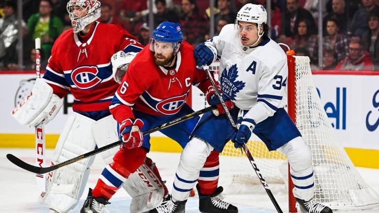
Montreal Canadiens
As a Bruins fan it pains me to say it but the Canadiens have one of the best sets in the league. They don't need to change a thing. Proposed fix: A blue third could be fun.
Nashville Predators
I was never crazy about the Predators' jerseys but they've only gotten worse since switching to the Adidas system. The base jersey is incredibly boring and there's just too much gold. Proposed fix: Their 2020 Winter Classic jerseys and logos were outstanding, so use those for inspiration for a full-time rebrand.
New Jersey Devils
The Devils' uniforms are perfectly fine. They probably won't make many people's lists for the league's best, but they're a sleeker version of New Jersey's classic look and I wouldn't change much. Proposed fix: Introduce a black alternate, which is long overdue at this point.
New York Islanders
There's nothing exciting about the Islanders' base jersey design but they've got a great logo and color scheme, so it works pretty well. Plus, the Islanders are more of a blue collar team anyway, so it feels fitting that their jerseys aren't overly fancy. Proposed fix: I'm brave enough to say it...Fisherman thirds.
New York Rangers
Don't mess with classics. Proposed fix: Bring back Lady Liberty as an alternate.
Ottawa Senators
The Senators got a much-needed refresh this offseason and, while I can't fully judge the new look until I see it in action, it does draw on the team's older style and it's certainly an in improvement already. Proposed fix: Mix in a red alternate at some point.
Philadelphia Flyers
The Flyers' current primary look is totally fine. As a fan of contrasting nameplates, they get credit for being the only NHL team to employ one. Proposed fix: Better black thirds.
Pittsburgh Penguins
The Penguins' primary set is great, though I would love to see them bring back the '90s "Robo-Penguin" logo at some point -- even if it's just for an alternate. Proposed fix: Ditch the yellow bucket on the current third jerseys. A black helmet would likely make those more palatable.
San Jose Sharks
The Sharks have steadily gotten more simplistic and minimal with their jerseys over the years, and now we've gotten to the point where they sit somewhere between "bland' and "painfully boring." (Their black thirds are unquestionably their nicest uni at the moment.) Proposed fix: Revamp the jerseys and add more striping/accents. Don't be afraid to reach back toward the '90s and incorporate more silver and white trim into the mix.
St. Louis Blues
The Blues' current primary look is very strong but I might consider going back to gold numbers on the back of the home jerseys. Other than that, there's not much to dislike. Proposed fix: Bring me more of those wild Gretzky-era sweaters (with the red) as alternates.
Tampa Bay Lightning
It's hard to tell the reigning Stanley Cup champs that they should switch anything up, but the Lightning have one of the most boring and flat looks in the league. Their unis are so minimalistic that they almost look like practice uniforms. Proposed fix: Transition their alternate logo (circular crest with "Tampa Bay Lightning hockey club") to primary, then add black and silver accents into the mix on the jersey. Go back to black breezers on the home uniform. And please, please ditch those horrendous black alternate jerseys.
Toronto Maple Leafs
The Leafs have plenty of problems but their logo and jerseys aren't among them. Their look is simple and classic, but it's clean and beautiful too. Proposed fix: Win a playoff series.
Vancouver Canucks
There may not be a team in the league that makes me feel more conflicted than the Canucks. I very much enjoy Vancouver's current color scheme and logo, but the jersey base isn't spectacular. (I really don't like the double-green striping on their alternates, either.) Then again, they also have the iconic skate logo and jerseys, too...it's impossible to pick a direction. Proposed fix: Stick with the current jerseys but tweak the alternate and keep the Skate in constant rotation.
Vegas Golden Knights
I'm not the biggest fan of gray jerseys and I think that Vegas should have a more colorful set, but their uniforms have grown on me since they were first introduced. The white away set is their best (and the white gloves are awesome) and I'm glad they're going to mix in some new jerseys this year, but I'll wait to reserve judgment on the new gold alternate and the red "Reverse Retro" jersey. Proposed fix: To be determined.
Washington Capitals
The Capitals were one of the first teams in the league to push a more modern design concept and I liked them initially, but I feel like they've become a bit stale. Also, I'm not a huge fan of the current wordmark they used in place of a crest/logo on the front of the jersey. Proposed fix: Modernize the throwback base jersey they've been using in recent years and utilize an actual logo, perhaps the Weagle.
Winnipeg Jets
I really like the Jets logo and color scheme, and I'll even go as far as to say I think their jersey set is a bit underappreciated even if it's not outstanding. I'm not crazy about the awkward dual arm striping on the away jersey but it's easy to forget that this is still their first crack at a primary uniform since reestablishing themselves in Winnipeg a decade ago. That's pretty impressive. (Their current alternates, though? Swing and a miss.) That being said, we all know these aren't their best jerseys. Proposed fix: Both of their Heritage Classic jerseys have been 10/10. Just make those the primaries.
"current" - Google News
November 28, 2020 at 05:05AM
https://ift.tt/2KNjeKo
NHL jerseys: An honest review of every team's current uniforms, from the classics to teams in need of a change - CBS Sports
"current" - Google News
https://ift.tt/3b2HZto
https://ift.tt/3c3RoCk
Bagikan Berita Ini


0 Response to "NHL jerseys: An honest review of every team's current uniforms, from the classics to teams in need of a change - CBS Sports"
Post a Comment